Icons can be used sparingly to support text, or as illustration in cases where photography isn't effective in communicating the subject matter.
Style
To match our Student Services style, icons and illustrations should be bold, with clean lines and no unnecessary decorative elements, reinforcing a confident, honest, youthful and sociable look and feel.
Student Services theme icons, an example our clean and simple style for icons
Icon use
Supporting text
Small icons can be used to call attention to important elements of content – e.g. a list of benefits or features, contact information, or a call-to-action.
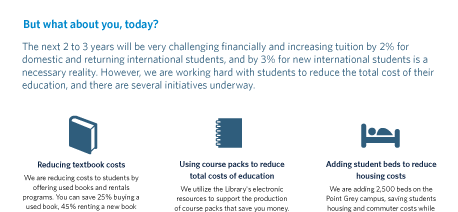
Icons used on tuition information sheet, to highlight ways the University is reducing costs for students
As illustration
When icons are used more prominently as illustration, their purpose should be to both set a distinct mood (e.g. for an event) and help the viewer absorb information. For example, the icons used in promotions for Career Days helped set a fun a youthful mood for the event – with bright colours and a mix-n-match concept – and communicated at-a-glance the wide selection of industries that students would have access to at the event.
Best practices
For an introduction to best practices in icon use, see Smashing Magazine's How To Use Icons To Support Content In Web Design and Spoonfed Design's A Guide to Using Icons in Web Design. Both of these articles are speaking about icon use in web design, but the basic principles they discuss can apply to icon use in print design as well.
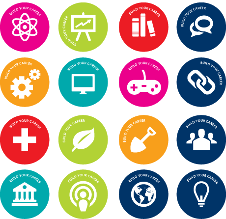
Icons used to represent industries and aptitudes on buttons for Career Days
Diagrams and infographics
All diagrams and infographics should follow typography guidelines, using Whitney and a similar clean and simple style.

Diagrams for the Build my career campaign